Web Design
Our website design process involves working closely with our clients to establish a brief, plan sitemaps and generate high-quality mockups that are both simple to use and visually engaging for your target audience.
Modern, stylish and functional
We've been designing websites for over 20 years, during which time we've seen the web change and grow a lot. Gone are the days of animated gifs and skeuomorphism, replaced with flat design and simplistic layouts.
Our design team works tirelessly to ensure are web design projects are up to date with the latest web design technology, trends and best practices.
Function over form
In web design it is crucial to remember the most important part of any business, the user. This is why we always think about the user experience first, and the aesthetic part second.
Web design is, above all else, about solving a problem. Do you want to sign people up to a newsletter? Are you trying to give out information about a new product? The problems you face will ultimately dictate the layout and content of the website.
Thinking about these problems during the design stage means we can identify and deal with any potential issues early on, meaning your website will be more beneficial to your users, and more successful.
"Mobile first" and other best practices
To build a website that performs well and has the longest possible life span we follow certain industry standards.
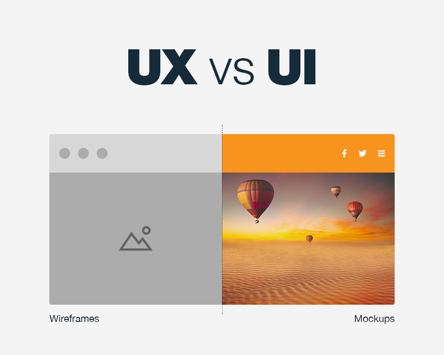
We start by creating low fidelity wireframes. These allow us to better understand what content is needed for the website, what problems need solving, and what journey the user might take. We use an approach called mobile first when designing websites. This means that mobile design, as the hardest, should be done first and designing for other devices will be easier.
Once we have agreed on the wireframes then we create high fidelity mockups. This is where we incorporate your branding into the project and the website starts to have its own unique feel. This part of the process is more subjective, so we will include you as much as possible when creating the final design.
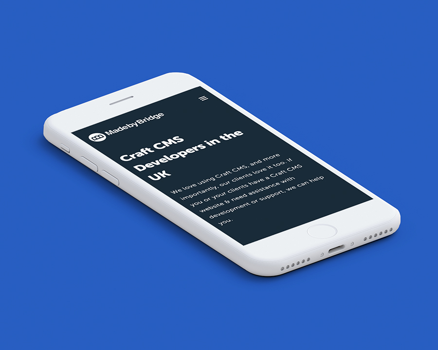
We design the product to be usable by all, by following accessibility guidelines and responsive design. This means making sure the content on the website works well on all devices and screen sizes, colours and text have sufficient contrast, and typography is clear enough for people to read.
Ready to talk to us?
If you have a project you'd like to discuss we would love to hear from you.